November 18,2021
6 Ways to Make Your Maximalist Room Feel Curated—Not Cluttered, According to Designers
by Jennifer Cameron inMediterranean Style
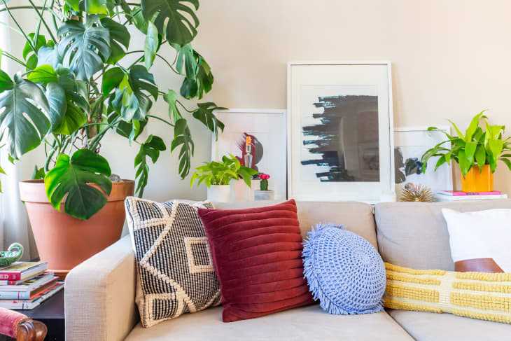
I’m a huge fan of maximalist design . I love color and pattern and tchotchkes—and even more so when they’re all layered together in a playful, energetic mix. But I also know that maximalism walks a fine line between “curated” and “cluttered.” Add one too many things, and you might be dealing with an avalanche of knickknacks or feel like your living room looks like a yard sale because you have so many pieces on all of your surfaces. If you’re toeing that tricky line, a little pro designer advice can help you make your brand of maximalism feel intentional and cohesive. Consider any and all of these strategies as tools in your maximalist decorating toolbox.

Start with a neutral foundation
“The key to mixing patterns and prints without it feeling overpowering is to have a neutral base to start your design process with,” says designer Ariel Okin . “Utilizing key pieces in tone-on-tone palettes—like sisal rugs and white Belgian linen sofas, for example—provides a clean canvas where you can add color and pattern in the form of pillows, art, throws, and more.”
Essentially, choosing visually quiet pieces for your major furnishings gives your eyes a break amidst all the playfulness of your decorative accents and flourishes. Think neutral for sofa, chairs, curtains, rugs, and even things like tables or bookshelves. Some of these pieces can certainly be poppy or patterned, but it’s a good idea to think about having a solid or two in this mix, whether that’s something wooden, upholstered, or otherwise. “This way, you aren’t incorporating too many areas where patterns can clash, and you also allow yourself the opportunity to swap things out if you eventually get sick of a pattern or color scheme,” says Okin.
Balance light and heavy design elements
Pay attention to the interplay between the silhouettes, shapes, textures, and materials of your major furnishings as well. Maximalist design schemes work better when a balance exists between light and heavy pieces, so the room doesn’t feel closed-off or super uniform. “This does not mean actual weight but visual weight,” clarifies designer Ana Claudia Schultz . “For example, if you have a bulky nightstand, offset it with a light and slim table lamp for balance.”
Use object curation and placement to your advantage
A maximalist space doesn’t necessarily mean a jam-packed space. In order for your decor to feel intentional, try to be strategic about what you display and how you display it. “Curation is key, and to do so, you should showcase items you love such as books, planters, and art but layer them using different heights or depth of field,” says Schultz.
For starters, Schultz says you can set a stack of favorite books on a coffee table and then add an accessory on top of that pile as well as another accessory on the tabletop itself—but not placed in a perfect line. “Move one piece off-center and center the other,” Schultz explains. This same tactic works on shelves and other surfaces for vignettes and even when you are arranging furniture to some extent. It’s always a good idea to stagger items and objects to create a more dynamic composition.
Limit visual noise
Building on the “curation is key” tip above, consider stowing items that don’t add anything decorative to the scheme of your room. Things like lotions, clothes, towels, and office supplies should be tucked away, as not to overwhelm the eye with “stuff.” That said, if you’re after a maximalist aesthetic, you can certainly put your collectibles on display and shop for statement-making storage pieces.
Textile designer John Robshaw suggests benches, trunks, and bins that have flair. “I have a wall of benches for seating with under-storage, which is an amazing place to still access the things you love,” says Robshaw. “Tibetan trunks come in all shapes and sizes and can be added behind chairs or beside beds, and they look interesting,” says Robshaw. You can also try storing linens and magazines in decorative baskets for easy access.
Utilize negative space
If your maximalist room is starting to feel a little too busy, negative space can be used to open up the design scheme a bit. “Give objects the opportunity to be a star,” says Alessandra Wood of Modsy, an online interior design service . “Allow a few select pieces to have room to breathe and take center stage.”
This might mean hanging a favorite work of art on its own wall or organizing a shelf so that one object is the focal point, suggests Wood. She also recommends leveraging a blank wall to allow an accent chair to pop. Every surface in your room—be it tabletops, walls, or floors—doesn’t have to be fully covered to create a maximalist look.
Create a narrative for your decor
There are all sorts of ways to create a maximalist room , but if you feel like yours is headed in the direction of “cluttered” rather than “creative,” you might be missing a narrative. Ask yourself things like: What is the theme or mood of the room? What do I want to feel or think of when stepping inside? Do all of the pieces add to that story, or are they just taking up space?
A room’s story doesn’t have to be something profound or high design—it’s your room and your aesthetic, so you decide what’s important to you. Having some kind of room story in mind when decorating though can help you choose and arrange your things cohesively, even when you like a more is more look. “Curated doesn’t have to mean super edited—it can also be a term to describe a grouping of objects where each was chosen to contribute to a larger story,” says Wood. “Use this approach when deciding what to put in your space and nix (or store) the objects that don’t support a larger narrative.”
