March 28,2023
My Favorite Interior Style Series: European Chic
by Jennifer Cameron inEuropean Style
7 interior design tips to steal from this European-inspired Seattle home
Lisa Staton Interior Design knows this house in Seattle very well indeed. Twelve years after the company first decorated the 1936-built brick property in the city’s Queen Anne neighborhood, the owners invited the team back to refresh their much-loved home.

The result is a bright, clean and slick reimagining that injects personality by embracing the owners’ love of art, and taking more than a few cues from across the pond. From the sprawling marble villas of Italy to the pared back elegance of Scandi design, this home has made Europe its muse.
‘We wanted to infuse modern into it with a casual elegance,’ said the team. ‘Modern furniture, carefully curated antiques and sculptural forms were paired together to keep things fresh and simple, but warm’.
For art-lovers looking to make their masterpieces pop, or Europhiles looking to transport their aesthetic across the Atlantic, here’s how to get this effortlessly cool look.
See: World's best homes – tour the globe’s most beautiful houses
1. For a modern classic, do it like an Italian
(Image credit: Lisa Staton Interior Design/Haris Kenjar)
For the Lisa Staton Interior Design team, it was the unusual floor-plan of the home that first got them thinking about Europe. ‘While it is traditional in form, it also has a very elegant and simple layout – almost like a classic Palladian villa,’ the team said.
Working with a 1930s house that had echoes of the Renaissance, the team found themselves inspired by ‘the way Italian and French villas merge modern with classic.’
‘While the cabinets are modern and streamlined, the blue French La Canche range and generous marble counters and backsplash nod to tradition. The master bath has an Italian Agape tub, which is a modern take on a classic claw-foot tub’
See: Ideas for small bathrooms – decor and design solutions for tiny washrooms
2. Ditch the upper cabinets for an airier kitchen
(Image credit: Lisa Staton Interior Design/Haris Kenjar)
A ‘game changer’ – that’s how the Lisa Staton team described the decision to remove all upper cabinets from their kitchen design. The result is an ‘open and airy’ room, which maximizes the sense of space by keeping all bulk below the eyeline.
The use of two under-counter fridge drawers and a separate pantry keep storage on the down-low, while a clean aesthetic was achieved through the use of ‘European-style cabinets’, which integrate the drawer-pulls into the doors, eliminating the need for visible handles.
3. Head north for a Scandi palette
(Image credit: Lisa Staton Interior Design/Haris Kenjar)
It’s not just Mediterranean Europe that has made waves in this home, but its Scandinavian neighbours too. ‘We found inspiration in a Nordic palette,’ said the team, using it deftly throughout the home, which has a gray-painted brick exterior.
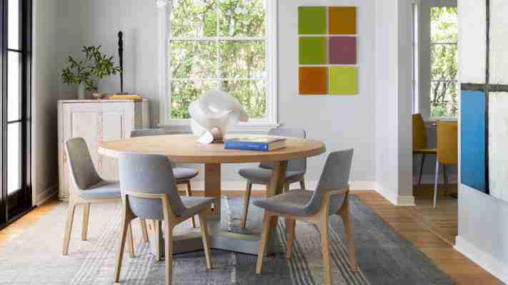
Inside, walls are painted white or powder gray, and matched with pale woods – in antique Swedish furniture and beyond – darker grays, and the occasional inflection of icy cool blues.
4. Let your art do the coloring
(Image credit: Lisa Staton Interior Design/Haris Kenjar)
Sticking to a Scandi palette does not, however, mean this home is a bastion of neutrality. ‘Our goal was to allow the rooms to harmoniously flow onto each other and allow a clean and crisp backdrop for art’, said the team, who have peppered almost every wall of the house with the owners’ extensive collection of artwork, from technicolor canvases that dominate entire surfaces to small white oak-framed prints. ‘There was a purposeful decision for the color to come from the art.’
5. To keep your marble modern, go monochrome
(Image credit: Lisa Staton Interior Design/Haris Kenjar)
It’s no secret that marble is a contemporary design darling – but use it wrong, and you’ll end up swerving into the kitsch. To keep it modern, Lisa Staton Interior Design has gone monochrome, using a pale white and gray Italian marble from Carrara across the house, only switching it up for vintage marble bedside table in black.
If you’re worried about coming off a little cold, use color elsewhere in the room to heat things up. ‘White oak cabinets add warmth against the long and generous custom marble backsplash,’ the team said of its use in the bathroom.
6. Treat your wood right
(Image credit: Lisa Staton Interior Design/Haris Kenjar)
With kitchen wall space left empty of upper cabinets, a large picture window was installed to let the outside in – but the view wasn’t the only touch of nature in the design. ‘After it was installed, we decided not to paint it and leave it as blond oak wood.’
A healthy respect for natural woods can be seen throughout the property, especially on the floors, which were all sanded and treated with Swedish blond wax, and sealed with Rubio Monocoat oil. ‘Not polyurethane – a very European approach,’ said the team.
See: Kitchen ideas – decor and decorating ideas for all kitchens
7. Search high and low for your textiles
(Image credit: Lisa Staton Interior Design/Haris Kenjar)
Layered textiles add a decadent feel to almost any design scheme – but that doesn’t mean you need to break the bank on every single piece. In the bedroom, the sheepskin rug at the base of the marble bedside table fits the bill as a luxurious way to take your first morning steps – it is, however, from CostCo.
In contrast, higher-end fabrics include the felted wool rug by Paulig that sprawls across the living room floor, having been handwoven in Morocco. In the dining room, a Turkish wool flat weave rug from Hedgerow – a vintage store based in Edison, just north of Seattle – brings texture to the room’s slick geometry.
Interiors / Lisa Staton Interior Design (opens in new tab)
Photography / Haris Kenjar (opens in new tab)
European Interior Design Trends
European Interior Design Trends

“European interior design” is a very general phrase for all the many design elements that go into the many different overlapping styles across Europe, such as Tuscan, Italian, Spanish, English and French. European interior design is deeply appreciated in modern America and inspires American interior design trends. As Europe continues to be the epicenter for interior design, here are some staple designs to follow for guidance in order to create a gorgeous European “look.”
Moulding & High Ceilings
European design often takes you back to the Victorian era with high ceilings and lots of detailed mouldings, paneling, and beams. Decorating with a European style produces a timeless and grand look. European architecture is known for its cathedral ceilings and opulent mouldings and design. Check out our blog to see how you can bringing these elements into your home: Judges Paneling.
Photo from @hauteblood
Black & White Checkered Floors
The European design element, black and white checkered floors, has been the standard for elegance in flooring for decades. The history of the checkboard design element dates to the late 1680s. This flooring was used on the ground floor landing of the Queen’s staircase at Versailles. This design then gained popularity in public buildings and great estates all over Europe and is the symbol of classic charm in interior design.
Photo from Architectural Digest
Marble & Stone
European design utilizes natural substances such as terracotta tile, marble, stone, brick, stucco, and hardwood materials. You will often see two materials incorporated into ones space to create a balance between textures. Stone and marble are two elements that we love to see together. If you are looking to create a European countryside aesthetic these design elements are key to achieving this look.
Wood Tones
Wood tones are a quintessential staple when it comes to all European interior design styles. Whether your going for a French countryside look or a luxurious Italian villa, wood tones will always be a typical design element in European styles. As stated earlier, European design utilizes natural substances since these materials are easily procured. Various distinctive designs are found throughout Europe due to the variation of natural materials available within each region. Wooden flooring is a common staple in European homes, and adding a herringbone design gives a truly European feel to your home.
Photo from the Fox Group
Old World Art
Just like European styles, old world art has a long and rich history that tells a story of the past and is meant to inspire you. The history of European artwork gives a sense of craftsmanship and use of high quality materials to give old world art a luxurious connotation. Check out our Old World Art blog post and see how you can add character to your home with old world art.
Photo from @JeanStofferDesign
Check out our European Interior Design Styles Pinterest Board for more inspiration and tag us in your pictures on Instagram, Pinterest and Facebook ! Follow us @WeAreWoodgrain
My Favorite Interior Style Series: European Chic
European chic : an interior style about old and new

My latest obsession on interior styles is something I call “European Chic”. Well, it is certainly a name I came up rather than a well defined category, but you get the idea: something inspired by Europe homes, and chic, AKA modern-ish. I love a space that reminds me of old houses in European with history, yet it doesn’t feel old. Just like those in the movies
