March 09,2022
This SoCal Beach Town is Every 2018 Color Trend in One Place, Pantone Study Says
by Jennifer Cameron inGarden Style

If you’ve found yourself gravitating towards colors reminiscent of outdoorsy vacations this year, you’re not alone. In their first ever social media study, the Pantone Color Institute quantified our collective wanderlust with the four most popular colors of 2018.
In the 2018 Colors of Travel study, conducted by HireInfluence , Pantone analyzed a mix of outdoor adventure and lifestyle travel photos with high engagement from dozens of the top travel influencers in the U.S. to identify the top four trending colors for this year—along with one destination that has them all.

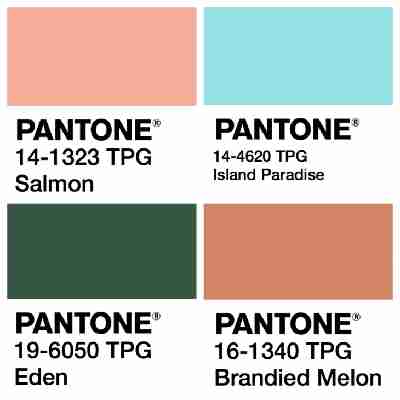
What the study revealed is that we all seem to need a vacation in a casual place where we can unwind deep in the embrace of Mother Nature’s bosom. The most popular colors for 2018 were: earthy, russet hues (matched to PANTONE 16-1340 Brandied Melon ); lush and verdant forest greens (matched to PANTONE 19-6050 Eden ); cleansing aquas (matched to PANTONE 14-4620 Island Paradise ); and coral-infused pinks (matched to PANTONE 14-1323 Salmon ).
“Inspirational travel photos on social media platforms such as Instagram play a huge role in how consumers are selecting their next destination,” says Stephanie Stabulis, Senior Strategy Director for HireInfluence, who oversaw the study. “Color and quality can generate impressive organic reach and engagement for these photos and help generate that must visit feeling in social audiences.”
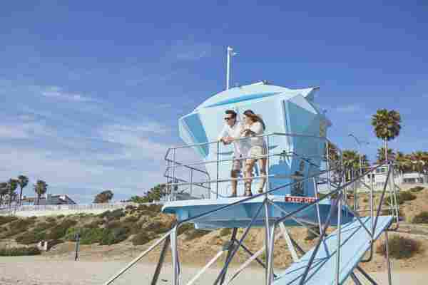
With that in mind, the Pantone Color Institute sought to identify destinations that incorporate all of those wonderful colors into their natural palette. Their top destination? Carlsbad, California —a quaint and approachable little beach town just 25 minutes north of San Diego, known locally as The Village by the Sea. It’s now highlighted in the Colors of Carlsbad . (Parents will know it as the home of the original Legoland .)
“From the ocean and lagoon waters to the rolling green hills and beautiful sunsets, colors highlighted in the 2018 Colors of Travel Study illustrate the coastal beauty, casual elegance, and laid-back glamour with family-friendly outdoor fun that Carlsbad is known for,” says Laurie Pressman, vice president of the Pantone Color Institute . “A blend of soft and warm with cool and calm expressing a marriage of land and sea; these colors encourage relaxation and provide refreshment, while at the same time stimulating the senses and our desire to explore and experience.”
If you’re now enticed to book a trip to check it out ( and Instagram it ) for yourself, Visit Carlsbad is celebrating the launch of the Colors of Carlsbad palette with Pantone with a variety of experiences and offerings that highlight the area’s culinary scene, creative arts, golf courses, seven miles of beaches, flower gardens, festivals and events, and destinations like the Legoland and Sea Life Aquarium parks. Browse all of the special deals from hotels, luxury resorts, vacation rentals, and budget-friendly options in the city at VisitCarlsbad.com .
