February 28,2022
Was Pantone Right All Along About This Once-Reviled Color?
by Jennifer Cameron inMediterranean Style
Each year, the color experts at Pantone make a pick for Color of the Year. Sometimes their selections are right on the money—in 2016, they correctly predicted the rise of Millennial pink . Other choices seem a bit…odd. 2014’s Radiant Orchid wore out its welcome fast, and while it’s a lovely color, I’m still kind of at a loss as to what to do with Ultra Violet . But by far the biggest head-scratcher of recent memory was 2015’s Marsala.
Even as I put together a roundup of Marsala in a few of our lovely house tours, I found myself a bit confused. This winey reddish-brown was hard to pin down, and, with only a few exceptions, very difficult to work into interiors. Some Colors of the Year are everywhere on their particular years, while other seem to fade quickly from the spotlight. Marsala was one of the latter, and nobody seemed particularly sad to see it go.

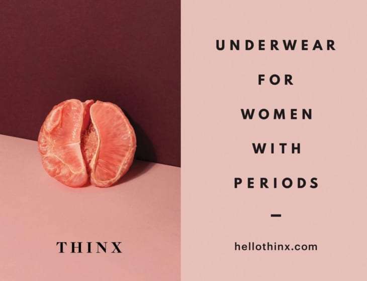
I hadn’t given much thought to Marsala after that—that is, not until the rise of Millennial pink , which brought with it a strangely familiar companion. This pale, salmon-y pink often came paired with slightly darker pinks—and often with a wine-colored shade that looked suspiciously like Marsala. You can see it in the Thinx ad above, often cited as an example of Millennial pink, as well as in the book cover for 2016 bestseller Sweetbitter , where the Marsala shade comes in in the form of actual wine.
Suddenly, paired with its hip new friend Millennial pink, Marsala seemed less fusty and strange and more stylish and forward-thinking. On its own, covering a whole wall, Marsala sometimes came off a bit bloody, but paired with a pale pink, it began to make sense.
Since then, I’ve seen Marsala (and its slightly more subdued cousin, mauve) crop up in quite a few interiors, usually paired with pink but sometimes with dark gray and occasionally even on its own. It may not be the Color of the Year, but it certainly feels like a color of this year, one that I can see playing a big role in 2018 and beyond. So does this mean that Pantone was right all along (just, perhaps, a little ahead of the curve)?
I suppose that only time will tell, but it does seem like shades of burgundy are experiencing a bit of a renaissance (along with dusty pink and teal green , two other shades associated strongly with the ’80s). What do you think? Is this a color you’d love to see come back? Or does it deserve to stay in the past?
